Color Grading & LUTs in Zella
Quick answer (Mac): Open the Effects tab in Zella’s editor to color grade. Apply one of 93 one-click cinematic looks (Teal & Orange, Kodachrome, Moody Dark, the 2026 creator pack, the 50-look Look Library, etc.) and blend it with the Look Intensity slider. Fine-tune exposure, contrast, saturation, temperature, and tint in the Color Board (Shadows/Midtones/Highlights). Use Color Match to copy a reference clip’s look and Scopes (luma histogram) to grade by data, not guesswork.
On iPhone: 92 looks live in Effects → Looks (the same catalog, including the 2026 creator pack), and grading stays a decision you make - Auto-Polish deliberately doesn’t grade your footage. See On iPhone.
On this page: what grading does · manual adjustments · 93 color presets · intensity · Color Match · scopes · where & when · on iPhone · impact · FAQ
What does color grading do?
Color grading (adjusting the colors and brightness of your footage) sets the mood and makes footage look intentional. It fixes problems - footage that looks flat, dull, or has the wrong white balance (colors that look too orange or too blue). It also adds style, like cinematic, warm, or moody. Raw screen and webcam footage almost always looks flat. A grade is what separates a plain “screen recording” from a “produced video.” Everything lives in the Effects tab: 93 looks, an intensity slider, a Color Board for hands-on control, Color Match, and live Scopes.
How to adjust exposure, contrast, saturation, temperature, and tint
Use the Color Board and adjustment controls in the Effects tab:
- Exposure - overall brightness (brighten a dark webcam shot).
- Contrast - the gap between the light and dark parts (adds “pop”).
- Saturation - how strong the colors are (don’t overdo it on skin).
- Temperature - warm ↔ cool white balance (fix orange-looking indoor light).
- Tint - green ↔ magenta correction.
- Shadows / Midtones / Highlights - adjust the red, green, blue, and brightness of the dark, middle, and bright parts of the picture separately, for precise control.
How to: open Effects → move a control → check the result in the preview and in the Scopes histogram (the chart described below).
How to apply a cinematic look (LUT) in one click
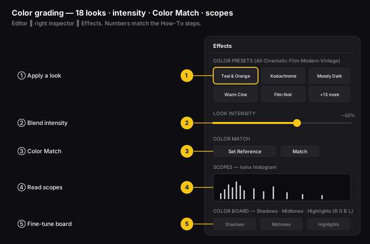
Figure: the color tools in the Effects tab. ① apply a look, ② blend with Look Intensity, ③ Color Match to a reference, ④ read the scopes, ⑤ fine-tune the Color Board.
- Open the Effects tab.
- Browse Color Presets, filtered by category: All · Cinematic · Film · Modern · Special · Vintage.
- Click a look to apply it instantly. This is a LUT (a preset that maps one set of colors to another, giving a finished look in one click). The 93 include Teal & Orange, Warm Cinematic, Moody Dark, Kodachrome, Kodak 2383, Fuji Natural, Film Noir, Velvia Vivid, Cool Tones, Bright & Sunny, Matte Fade, 80s Pastel, Palm Springs, Skin Warm, Log Flat, the 2026 creator pack (Soft Glow, Bright Airy, Peachy, Terra Brown, Retro Halation, Tokyo Soft, Punchy), and more - each a different grade.
How to blend a look with the Intensity slider
A look at 100% is often too strong. Use Look Intensity to dial it back:
- 0% = your original footage.
- 100% = the full look.
- ~40-70% = a natural result that looks graded, not like a heavy filter.
How to: apply a look → drag Look Intensity down until it feels real. At every value, it blends smoothly between your footage and the look.
How to match the color of two clips
Zella Pro: Color Match and Scopes are hidden behind the Advanced Tools switch (Settings sidebar). Flip it on once to reveal them. The 93 one-click looks, the intensity slider, and the Color Board above are all free.
Color Match shifts one clip’s colors toward another clip’s look. It’s perfect for making two cameras match, or matching a cool-looking clip to a warm one.
- Move the playhead (the marker that shows your spot in the timeline) to the reference frame - the one with the look you want.
- In Color Match, click Set Reference.
- Move to the clip you want to change.
- Click Match - Zella figures out the color shift needed to match the reference.
How to read the Scopes (luma histogram)
Scopes show a luma histogram (a chart of how bright or dark the pixels are) for the frame at the playhead, so you can grade using data instead of guessing:
- Left = the dark parts (shadows), right = the bright parts (highlights).
- A tall spike on the far left means crushed blacks (dark areas so dark they lose detail). A spike on the far right means blown highlights (bright areas so bright they lose detail).
- A healthy image usually spreads across the whole range.
- The chart updates as you move the playhead and grade. A refresh control redraws it.
How to: find Scopes in the Effects tab → watch it while you push contrast and exposure so you don’t lose detail.
Where and when to color grade
- Where: intros (a strong look), tutorials (subtle correction only), reels (stylized looks), product shots (warm and premium), and multi-camera edits (Color Match to make cameras agree).
- When: after cleanup and before titles and export. Grade once your cut is locked, so you’re not re-grading footage you’ll later delete.
- Black & white treatment: apply a mono (single-color, black-and-white) look and your captions keep their color. It’s a stylish way to drain the color while staying readable.
On iPhone
Grading is not a desktop-only job. The phone carries the same catalog and the same pro tools.
The looks
Open Effects → Looks and tap one. There are 92 color looks on iPhone (the shared catalog, including the 2026 creator pack and the 50-look Look Library of film, vintage, moody, airy, mono, food, landscape, night and duotone grades), plus 3 Founder-exclusive grades for 95 in total. The Mac carries 93 base looks (the same catalog plus its extra “Pop” look) and the same 3 grades for 96. Everything else about them is identical - same one-tap application, same blending.
Looks brighten - they never shade you. Every bright and neutral look leaves the frame’s brightness even edge to edge; none of them darkens your face or corners. Exactly five deliberately dark looks (Film Noir, Moody Dark, Dark Academia, Espresso and the Founder Noir) shade the corners gently, because that shading is their identity - and even they are capped by an automated test that measures the corners on every build. If you want a vignette on a bright look, it stays a separate, deliberate effect you add yourself.
The 2026 creator pack
Seven looks built from what creators actually run this year, every one tuned to lift:
- Soft Glow - the beauty-filter look: lifted exposure, warm skin, softness from glow rather than blur, so texture survives.
- Bright Airy - whites up, pastel-soft contrast, a breath of cool so it never turns yellow.
- Peachy - the warm-pink Instagram identity, with skin protected.
- Terra Brown - the earthy influencer grade: moody brown, not dark.
- Retro Halation - 70s-print warmth with glowing highlights and a whisper of grain.
- Tokyo Soft - clean and modern with one warm orange push in the midtones.
- Punchy - the scroll-stopper: bold contrast and skin-safe vibrance, still inside every discipline cap.
Auto-Polish leaves your color alone, on purpose
Worth knowing before you go hunting for a “why did my footage change colour” answer: Auto-Polish does the cuts, captions, voice, music and zooms, but it does not apply a grade. A preset forced onto footage it wasn’t made for does more harm than good, so the looks stay one deliberate tap away in Effects → Looks.
Color Match and the luma scope
Both are on the phone, and on both platforms they’re Zella Pro - part of the depth toolset alongside keyframes, the curve editor, feathered masks and speed ramps. On the Mac they sit behind the Advanced Tools switch described above.
As always, the toolset gates the controls, not your video: a project already graded with Color Match still previews and exports on every tier, and every new install gets Pro Week - the full Pro set free for seven days, no card, nothing to cancel.
What’s free everywhere
The one-click looks and the ability to grade and export your video are free on both platforms, watermark-free. Free is capped only on export length (2 minutes) and resolution (1080p), and 1080p is free forever.
Full guide: On-device AI → · The iOS editor →
What impact color grading has when done right
For content creators and video editors, a good grade delivers:
- Looks higher quality - graded footage looks professionally produced, which raises trust and how many people finish watching.
- Brand consistency - using the same look every time (for example, your channel’s warm grade at 50%) makes every video recognizable.
- Visual clarity - correct brightness and contrast make menus and faces easier to see, so fewer people click away.
- Mood control - warm vs. cool vs. moody changes how the message feels before a word is spoken.
Over-grading (crushed blacks or neon-bright colors) does the opposite. The Scopes are your safety check.
Color grading FAQ
What’s a LUT / “look”? A LUT is a preset that maps one set of colors to another, applying a finished grade in one click. Zella ships 93 on the Mac and 92 on iPhone, and you can blend each one with the Intensity slider.
How strong should a look be? Usually 40-70% intensity. Full strength looks like a heavy “Instagram filter.”
Can I keep captions in color on a black-and-white video? Yes - apply a mono grade. The footage turns black and white while the captions keep their color.
How do I fix orange/blue footage? Adjust Temperature (warm ↔ cool) in the Color Board. Use Tint for green or magenta.
Why is my image losing detail in the shadows? You’ve crushed the blacks (made the dark areas too dark). Check Scopes and lift Shadows in the Color Board until the spike on the left eases off.
Can I color grade on my iPhone? Yes - 92 looks on iPhone in Effects → Looks (the shared catalog, including the 2026 creator pack: Soft Glow, Bright Airy, Peachy, Terra Brown, Retro Halation, Tokyo Soft, Punchy), free and watermark-free. With the 3 grades exclusive to Founder, that is 95 on iPhone and 96 on the Mac.
Does Auto-Polish grade my footage on the phone? No, deliberately not. Grading is a taste decision, so the looks stay one tap away in Effects → Looks and Auto-Polish leaves your color alone.
Pro tips & gotchas
- Start from one of the looks, then pull the Look Intensity slider back to about 40-60% for a believable grade.
- Use Color Match to make a clip match a reference frame quickly.
- Open the scopes (luma histogram - the brightness chart) to check that you’re not crushing the darks or losing detail in the brights.
- For fine control, the Color Board adjusts the dark, middle, and bright parts of the picture separately.
- On the phone, grade after Auto-Polish, not before. Auto-Polish never touches your color, so a look you apply first survives - but grading a locked cut still beats grading footage you’ll delete.
Related: Effects (vignette, glow, grain, blur) → · One-click polish → · Export → · On-device AI on iPhone →