Short-form video wants a slightly warm, gently contrasty grade: enough that skin looks alive, not so much that it reads as a filter. Start from a preset look, pull its intensity down to 40-70%, and use one look for the whole video. Zella ships 42 free colour grades on iPhone and 43 on Mac with an intensity slider, and grading stays a deliberate step rather than something Auto-Polish decides for you.
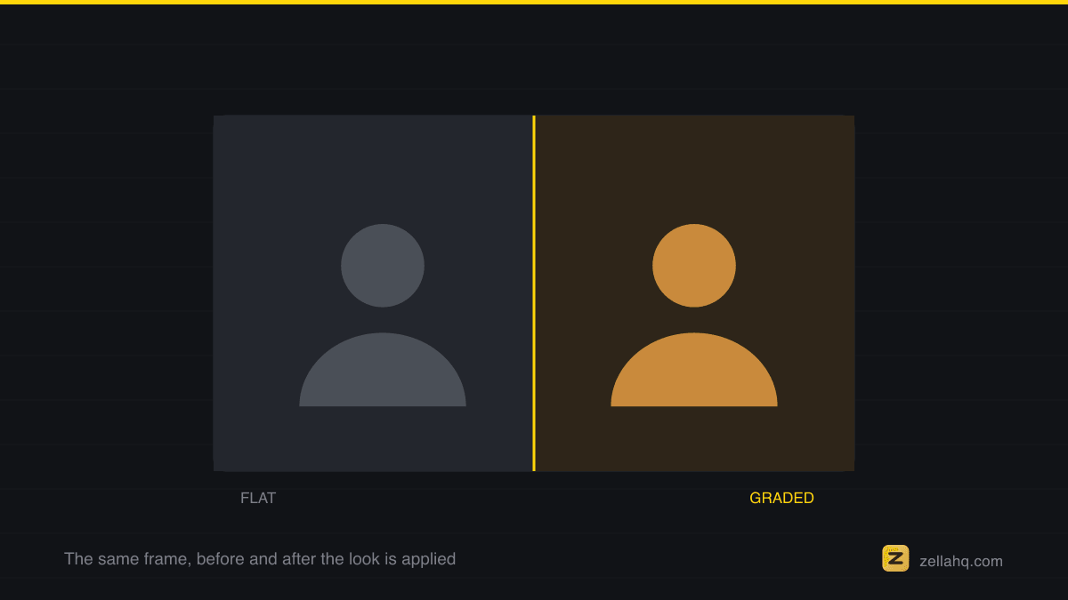
Put two phone recordings side by side - one straight off the camera, one with a modest grade - and the graded one simply looks more expensive. Not different in content, just finished. Color is the last mile of perceived production value, and in short-form it follows a few practical rules that have nothing to do with cinema-school color theory.
What "pop" actually means
When people say a short "pops," the image usually has:
- Warmth - skin pushed slightly golden rather than clinical. Warm reads as healthy and inviting on small screens.
- Gentle contrast - deeper shadows and controlled highlights, so the frame has depth instead of the flat, milky look of raw log-ish phone footage.
- Controlled saturation - richer than raw, but skin still looks like skin. Oversaturation is the most common tell of an amateur grade.
- Consistency - every clip in the video matched. A grade that shifts between cuts is worse than no grade.
Grading assumes a colour space, and almost everything published to the web is Rec. 709, the ITU standard for HD video.
The intensity trap: why 100% always looks wrong
Almost every bad grade is a good look applied at 100%. Preset looks are designed to be visible in a thumbnail comparison, which means full strength is nearly always too much for a whole video. The professional move is boring: pick a look, then pull it back to 40-70%.
This is why an intensity slider matters more than the number of presets. Zella ships 25 free colour grades on Mac and iPhone alike (28 in total - three are Founder-exclusive), every one with an intensity slider - and supports .cube LUT import if you have a look you already love. The workflow is: apply, then drag intensity down until you can almost not tell it's there. That is usually the right amount.
Which looks work for talking heads
- Warm cinematic - the default for a reason: golden skin, soft teal-ish shadows, gentle contrast. Flattering on every skin tone and every phone camera.
- Film emulations (Kodak-style) - slightly lifted blacks and organic color; good for storytelling and lifestyle content.
- Moody/dark - high contrast, desaturated; suits tech and finance content, but watch that your face doesn't fall into shadow.
- Avoid heavy stylization (strong teal-orange blockbuster grades, hard matte crushes) for talking-head shorts - they photograph well on landscapes and read as costume on faces.
A two-minute grading workflow
- Fix exposure first - a grade cannot rescue a badly exposed face.
- Apply one preset look to the whole timeline, not per clip.
- Pull intensity to 40-70%.
- Check skin on the phone screen you actually post from, not just your editing display.
- Stop. One look per video.
One thing worth knowing: Zella's Auto-Polish does not grade for you. It handles cuts, captions, sound and music in a single tap and leaves colour alone entirely, so a look you picked is never overwritten and a look you never chose never shows up. Grading stays two taps you take on purpose: pick the preset, drag the intensity down.
Frequently asked questions
How do I make phone video look cinematic? Correct exposure and white balance first, then apply one consistent look that warms the skin slightly, deepens the shadows for gentle contrast, and richens saturation without letting skin go orange. Keep it subtle - pull any preset back to 40-70% strength. Overdoing it is what makes footage look filtered, not cinematic.
What is the difference between color correction and color grading? Correction makes the image look natural and accurate - fixing exposure, contrast, white balance and tint. Grading is the creative layer on top: the warm, moody or filmic mood you add once the base is neutral. Always correct before you grade.
Why does iPhone footage look over-saturated? Phones push reds and skin tones hard by default. A cinematic grade usually pulls saturation back a touch and desaturates reds selectively, which is why restrained grades read as more expensive than punchy ones.
How much should I turn a LUT or preset down? Most preset looks are built to be obvious in a thumbnail comparison, so full strength is nearly always too much. Drag intensity down until you can almost not tell it's there - usually 40-70%. That is the right amount.
Should I use one look or grade each clip separately? One look, applied to the whole timeline. A grade that shifts between cuts is worse than no grade - consistency is most of what makes footage feel finished.
Make your next video with Zella.
Record, edit and ship on Mac and iPhone - local, private, free to start.
PART OF A SERIES
Colour grading and looks
The 46 looks, the intensity slider, and why a filter can make a shot worse.
- How to Color Grade a Video on Mac (LUTs Made Simple)
- How to Color Grade Phone Video to Look Cinematicyou are here
- Why Does My Video Look Dull After Adding a Filter?
- How to Add a Vignette and Film Grain to a Video on Mac
All of it lives under Effects & Color.
RELATED