To add text to a video, pick the type that fits the job: a title card to open a section, a lower-third to name a speaker, and kinetic captions for anything spoken. Keep every word inside the center 80 percent of the frame, set primary text at 48 to 72px on a 1080 x 1920 canvas, and put white text on a dark backing so it survives a muted phone screen.
Adding text to a video means placing readable words on screen at the right moment: a title card to set up the video, a lower-third to name who is talking, or kinetic captions that follow the spoken word. The rules that matter most are readability rules: keep text inside the safe zone, make it big, use a clean font, and put it on high contrast so it survives a muted, small-screen viewing. Here is how to do each type well.
Why does text matter so much in video?
Because most people watch without sound. About 92% of viewers watch mobile video with the sound off (Kapwing), and 80% of consumers say they are more likely to finish a video when it has captions (3Play Media). One frequently-cited industry comparison puts completion at around 91 percent for subtitled videos against 66 percent without. No platform publishes a figure like this, and the gap is almost certainly flattered by which videos get subtitled in the first place - but the direction is consistent everywhere it has been measured. On-screen text is not decoration anymore, it carries your message to the silent majority.
What are the main types of text in a video?
There are three workhorses, and each has a specific job.
| Type | What it is | When to use it |
|---|---|---|
| Title card | Full-screen or large text on its own, usually at the start or between sections | Open the video, name a chapter, deliver a key statement |
| Lower-third | A text block in the bottom portion of the frame naming a person or thing | Introduce a speaker, label a location, show a handle |
| Kinetic captions | Word-by-word animated subtitles synced to speech | Talking-head, tutorials, any spoken content, especially vertical social |
Define your terms: a lower-third is a graphic that sits in the lower area of the screen (traditionally the bottom third) showing a name, title, or label without covering the subject's face. Kinetic text (or kinetic typography) is animated text where words appear, move, scale, or highlight in rhythm with the audio, rather than sitting still.
How do I add a title card?
A title card orients the viewer before the action starts. To add one:
- Place it at the very start (or between sections) on its own beat, 1.5 to 3 seconds long.
- Keep it to one idea: a title, a name, or a hook, in 3 to 7 words.
- Animate it in and out so it does not just pop. A subtle fade or slide reads as polished.
In the editor, Zella includes 20 animated title styles with gradient fills, stroke, shadow and box backing, plus dedicated full-screen intro and outro cards. Use the animation to add energy, not to distract: keep the entrance under about half a second so the card is readable for most of its run.
How do I add a lower-third?
A lower-third labels who or what is on screen without stealing focus.
- Position it in the bottom portion of the frame, but stay out of the very bottom 20% where platform buttons and captions live.
- Use two lines at most: a bold name on top, a lighter role or detail below.
- Bring it in when the person starts speaking and take it out after a few seconds. It does not need to stay up the whole time.
- Keep it left-aligned near the safe-zone edge so it feels anchored, not floating.
Lower-thirds are the industry-standard placement for on-screen labels, generally in the bottom 25% of the frame (OpusClip).
How do I add kinetic captions?
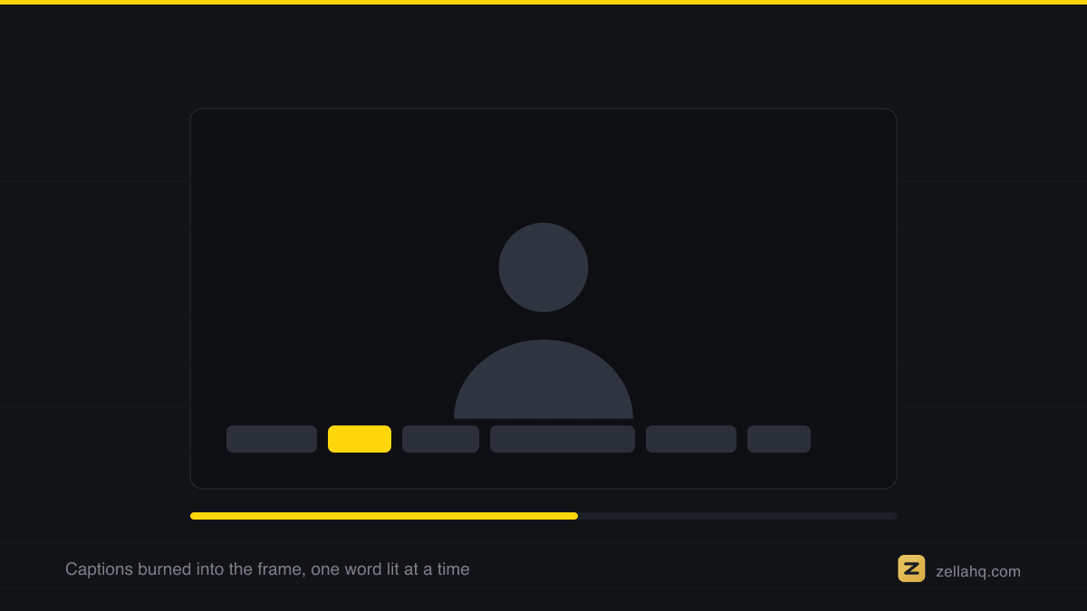
Kinetic captions are the highest-impact text for spoken content because they pull the eye word by word and keep silent viewers reading.
- Generate a transcript, then let the captions sync to the audio automatically.
- Show only 1 to 2 lines at a time, roughly 5 to 8 words per card.
- Highlight the active word so the eye tracks the sentence.
- Keep the style consistent across the whole video.
Zella creates captions on-device, so nothing is uploaded. There are 10 presets on Mac and 9 on iPhone (Word Pop, Hormozi, Karaoke, Pop Box, Neon Glow, Clean Minimal, Beast, Highlighter, Bounce, and Hero on Mac), each with active-word highlighting, plus SRT import and a transcript word editor for fixing a misheard name.
Auto-Polish adds captions automatically alongside the silence and filler cuts, and the full captions and titles toolset lets you fine-tune afterwards. For style inspiration, see the best caption styles for short-form video, and to caption automatically, read how to automatically caption a video on Mac.
What are the readability rules for text on video?
This is where most videos go wrong. Follow these rules and your text stays legible on a phone, muted, in daylight.
- Font: Use a clean, simple sans-serif. Avoid thin weights and decorative or script fonts, especially on small screens.
- Size: The minimum readable size on mobile is about 36px at 1080x1920. A workable starting point is 48 to 72px for primary text and 32 to 40px for secondary, on a 1080-wide canvas. These are practitioner conventions rather than measured optima, and they exist because anything smaller stops being readable on a phone held at arm's length.
- Safe zone: Keep all text within the center 80% of the frame vertically and the center 90% horizontally. Avoid the bottom 20 percent, where platform interface and captions overlap.
- Contrast: White text on a dark backing is the gold standard, delivering a 21:1 contrast ratio that exceeds accessibility guidelines. Add a semi-transparent box, drop shadow, or outline so text survives busy backgrounds (OpusClip).
- Word count: Keep it tight. A 15-second clip should carry roughly 40 to 60 words of overlay text total; a 30-second clip, 80 to 100 words maximum. Aim for 5 to 8 words per card and no more than two visible lines - roughly what someone reads without pausing.
When should I use each type of text?
- Use a title card to open the video, mark a new section, or land one big statement. One idea per card.
- Use a lower-third to name a person, place, or product the first time it appears, then let it fade.
- Use kinetic captions for anything with speech. They serve the roughly 92% who watch on mute and lift completion rates.
- Use callouts and arrows when you need to point at something specific on screen (a button, a stat). That is a different tool, covered in how to add arrows and callouts to a video.
Frequently asked questions
What is a lower-third in video? A lower-third is a text graphic placed in the lower portion of the frame that identifies a person or thing, usually a name plus a role or detail, without covering the subject's face. The name comes from its traditional placement in the bottom third of the screen.
What is kinetic text or kinetic typography? Kinetic text is animated text where words appear, move, scale, or highlight in time with the audio, rather than sitting static. It is popular for captions in short-form social video because the motion holds attention and tracks the spoken word.
What font size should video text be? On mobile at 1080x1920, keep primary text around 48 to 72px and secondary text 32 to 40px, with a practical minimum of about 36px. Bigger is safer, since viewers are on small screens.
Where should text go so it is not cut off? Keep all text within the center 80% of the frame vertically and center 90% horizontally, and avoid the bottom 20% where platform buttons and auto-captions appear. This is the safe zone.
Do I need captions if my video already has narration? Yes. About 92% of mobile viewers watch on mute, and captioned videos are watched to completion far more often, so captions reach the audience your narration alone cannot.
Can I add text and titles to a video for free on a Mac? Yes. Zella is a free, on-device recorder and editor with 12 title templates and 16 kinetic entrances, 10 caption presets on Mac (9 on iPhone) with active-word highlighting, Text Behind Subject, and 1080p export up to 2 minutes, watermark-free. It is heading for the Mac App Store; Zella for iPhone is out now on the App Store. See what is in the free plan.
Make your next video with Zella.
Record, edit and ship on Mac and iPhone - local, private, free to start.
PART OF A SERIES
Titles and on-screen text
Title styles, safe zones, highlights, and text that sits behind you.
- How to Add Text and Titles to a Video: Sizes and Safe Zonesyou are here
- How to Put Text Behind a Person in a Video
- How to Animate a Text Highlight in a Video
- How to Highlight On-Screen Text Already in a Video
- How to add an intro and outro card to a video on iPhone
All of it lives under Captions & Callouts.
RELATED